
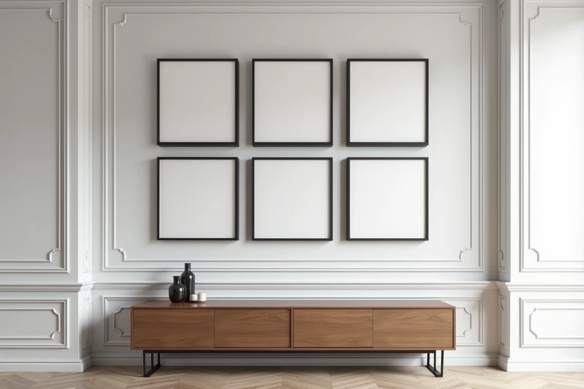
Five identical frames on a wall is a more demanding composition exercise than a display of mixed formats. The uniformity of dimensions eliminates the visual compensation margin offered by size variations. Every spacing discrepancy, every shift of a few millimeters is immediately noticeable. Here, we review five concrete arrangements, each suited to a specific wall type and spatial constraint.
1. Strict two-three grid aligned with an architectural line
You may also like : What is the importance of HR in a company?
The grid remains the most structured configuration for identical frames. With five units, the two-three format imposes an empty space. It is precisely this emptiness that creates graphic tension. We recommend placing it in the bottom left or top right to avoid a “missing box” effect that is too centered.
Alignment should be done along an architectural guiding line: the high edge of a sideboard, the back line of a sofa, an existing picture rail. Museum professionals prefer this anchoring on a physical element rather than an arbitrary centering in the middle of the wall. The result gains coherence with the furniture.
See also : Mastering the Art of Exiting a SCPI: Strategies and Tips
The spacing between frames, in this configuration, should remain identical horizontally and vertically. A gap of a few centimeters is sufficient. Beyond that, the grid loses its readability and the frames seem to float independently. To understand how to adjust a layout of 5 frames on a wall according to the exact proportions of your space, the paper template method remains the most reliable.
2. Horizontal band aligned at the center of the frames
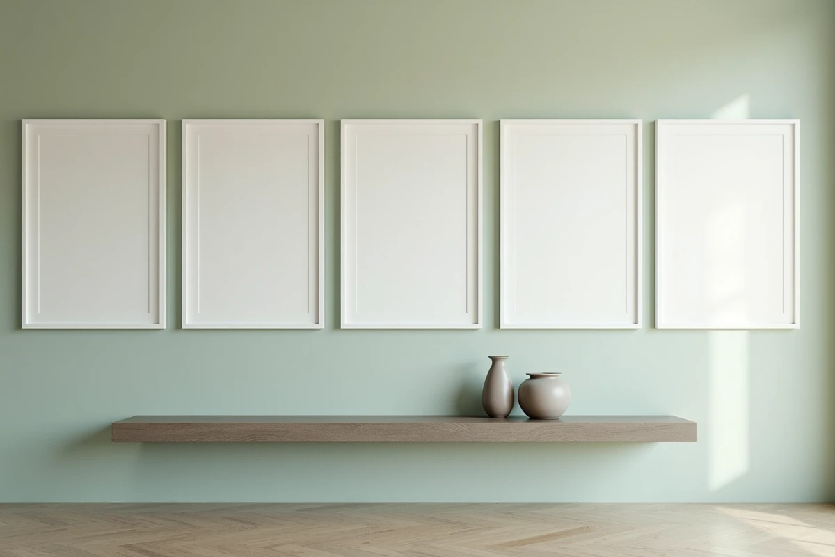
The single horizontal line works on elongated walls: hallways, headboards, console tops. The five frames align on a common median axis, visually stretching the space in width.
The median line should be at eye level, slightly below the middle of the wall. Installation kits offered by some specialized brands (Desenio, Poster Store) include a standardized height guide that applies this principle. Ignoring this rule produces the “too high band” effect regularly observed in interiors.
The trap of the horizontal band is monotony. To break it without disrupting the rigor, we suggest varying the visual contents within the frames (black and white photography alternated with a graphic pattern, for example) while keeping identical mats. The structure remains geometric, and the eye flows.
3. Stair-step arrangement along a staircase
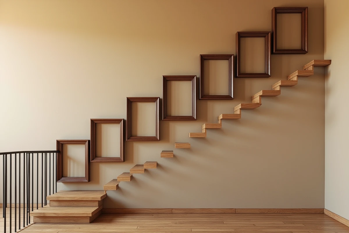
The stair-step hanging exploits a constraint that other configurations ignore: the slope. Each frame descends one step regularly compared to the previous one, following the incline of the railing or handrail.
The vertical offset between two consecutive frames should reproduce the height of a step (or a multiple). Aligning the rhythm of the frames with the step of the staircase avoids the impression of random slipping. We first draw a line parallel to the slope, then distribute the five hanging points at regular intervals along this line.
This arrangement requires precise measurement of the angle. An adjustable laser level simplifies the task. Without this tool, a string stretched between the first and last planned point, temporarily taped, allows for checking diagonal alignment before drilling.
4. Asymmetrical cross centered on a focal point
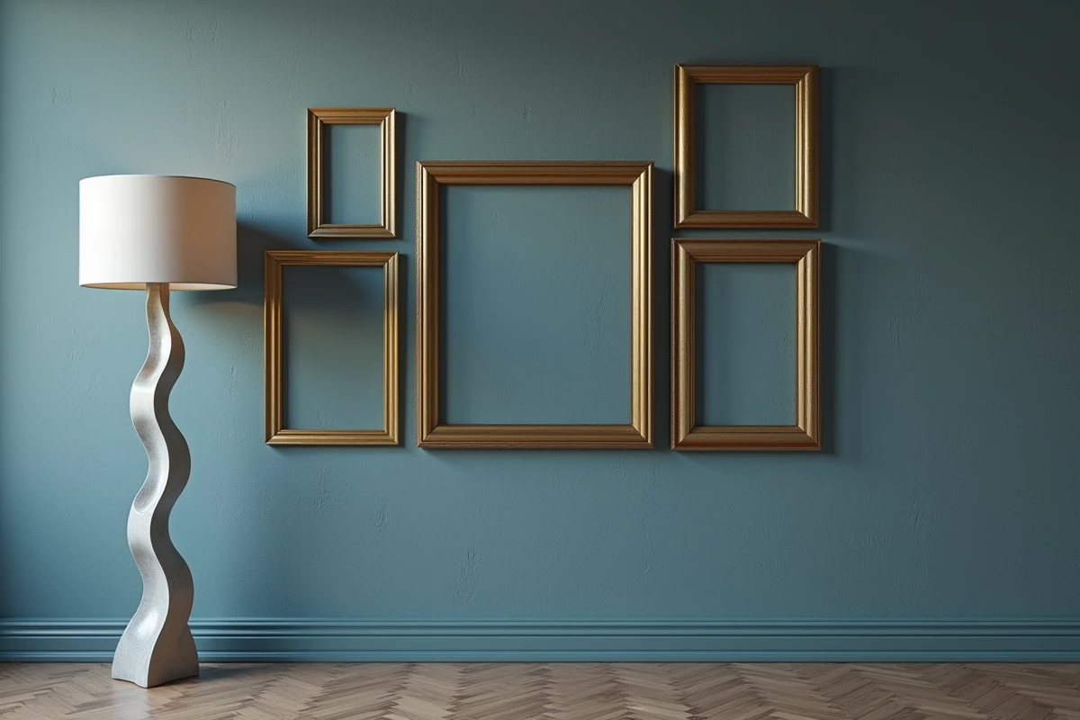
The cross places one frame at the center and distributes the other four along the vertical and horizontal axes. With five identical frames, the result creates an additional pattern. The central frame anchors the composition and serves as a focal point around which the gaze orbits.
Asymmetry plays on the distances: one arm of the cross shorter than the other, or a side frame slightly shifted upwards. This controlled variation breaks the rigidity of the pattern without losing structure. The trends for 2024-2025 observed among major decor brands confirm this return to ultra-structured compositions for identical frames, with the asymmetrical cross fitting into this graphic logic.
This configuration is suitable for walls with dimensions close to square. On a very elongated wall, the cross appears laterally compressed and loses its impact.
5. Vertical column with progressive spacing
The vertical column stacks the five frames on a single axis. To avoid the “stack of bricks” effect, we apply progressive spacing: the gap between the first and second frames is the smallest, then it increases slightly with each subsequent interval.
Progressive spacing creates an impression of upward breathing. The gaze naturally rises from the lowest frame to the highest, which enhances the perception of ceiling height. This configuration is particularly suitable for narrow pilasters, wall sections between two doors, or unused vertical spaces in an entryway.
The mounting hardware deserves special attention here: five frames aligned vertically concentrate the load on a narrow strip of the wall. On drywall, expansion anchors or high-capacity repositionable adhesive mounts are preferable to simple nails.
- Check the nature of the wall (drywall, concrete, brick) before choosing the appropriate mounting
- Use a full-size paper template taped to the wall to validate the progressive spacing before any drilling
- Prefer attachments that allow lateral adjustment of a few millimeters after installation, to correct any potential misalignment
The choice between these five arrangements primarily depends on the geometry of the wall and the accompanying furniture. A sofa calls for the grid or horizontal band, a staircase imposes the diagonal, a narrow pilaster justifies the column. The most harmonious arrangement is the one that interacts with the existing architecture, not the one that arbitrarily overlaps it.